最新的Claude-opus-4-7在科研场景到底有多强...
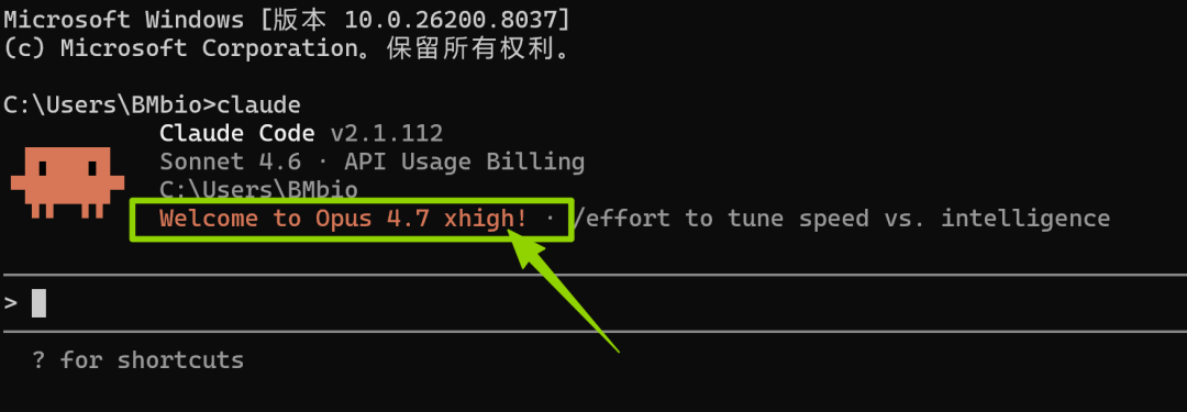
所以,关注百沐一下,不止是Claude opus 4.7,期待与您一起在未来探索更多模型的学术实战上限。希望Claude可以生成成差异表达分析图,GO图,Venn图,火山图和聚类分析图。对比之前的Claude 4.6生成的灰色图片(如下),上面这些彩色生信分析图,实话讲,确实会给投递顶刊的文章,加不少分。首先输入上面的指令,切换成最新的Claude-opus-4-7,当电脑出现下面的界面就代表操作
Claude Opus 4.7 深夜上线,又一波AI的大更新开始了...
听说,新的Claude Opus 4.7 相比于之前在图像处理、处理任务、执行指令方面又有了新的提升。
这咱不得吃上第一口热乎螃蟹,用咱的单细胞数据来测试一下,新模型在科研场景,生信数据分析上的表现如何!
一、切换模型
/model claude-opus-4-7首先输入上面的指令,切换成最新的Claude-opus-4-7,当电脑出现下面的界面就代表操作成功了!
二、实践环节
小编这里用之前测序的C2样本(换任何一个样本都可以),单细胞数据为例。希望Claude可以生成成差异表达分析图,GO图,Venn图,火山图和聚类分析图。
输入下面指令:
请你帮我分析C2这个样本,生成差异表达分析图,GO图,Venn图,火山图和聚类分析图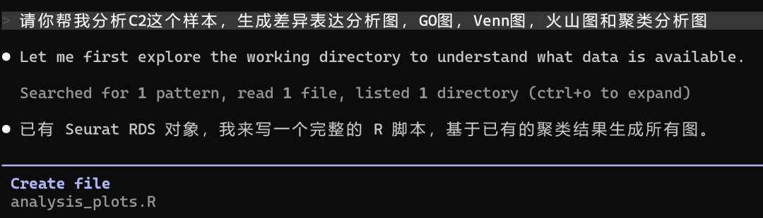
然后单细胞RNA-seq的数据进行了下面的深度分析,小编就可以摸鱼去了(不是)。
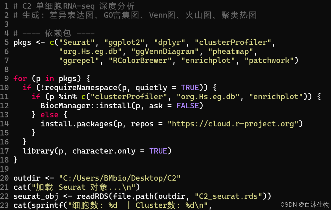
以下是Claude-opus-4-7模型生成的R包(速速码住!)
# C2 单细胞RNA-seq 深度分析
# 生成: 差异表达图、GO富集图、Venn图、火山图、聚类热图

# ---- 依赖包 ----
pkgs <- c("Seurat", "ggplot2", "dplyr", "clusterProfiler",
          "org.Hs.eg.db", "ggVennDiagram", "pheatmap",
          "ggrepel", "RColorBrewer", "enrichplot", "patchwork")

for (p in pkgs) {
  if (!requireNamespace(p, quietly = TRUE)) {
    if (p %in% c("clusterProfiler", "org.Hs.eg.db", "enrichplot")) {
      BiocManager::install(p, ask = FALSE)
    } else {
      install.packages(p, repos = "https://cloud.r-project.org")
    }
  }
  library(p, character.only = TRUE)
}

outdir <- "C:/Users/BMbio/Desktop/C2"
cat("加载 Seurat 对象...\n")
seurat_obj <- readRDS(file.path(outdir, "C2_seurat.rds"))
cat(sprintf("细胞数: %d  | Cluster数: %d\n",
            ncol(seurat_obj), length(unique(Idents(seurat_obj)))))

# ================================================================
# 1. 差异表达分析 (FindAllMarkers)
# ================================================================
cat("\n[1/5] 差异表达分析...\n")

markers_all <- FindAllMarkers(
  seurat_obj,
  only.pos  = TRUE,
  min.pct   = 0.25,
  logfc.threshold = 0.25,
  test.use  = "wilcox"
)

# 每个cluster取top5
top5 <- markers_all %>%
  group_by(cluster) %>%
  slice_max(order_by = avg_log2FC, n = 5) %>%
  ungroup()

# DotPlot: 差异表达概览
p_dot <- DotPlot(seurat_obj,
                 features = unique(top5$gene),
                 cols = c("lightgrey", "#E64B35")) +
  RotatedAxis() +
  ggtitle("各Cluster Top5差异表达基因") +
  theme(plot.title = element_text(hjust = 0.5, face = "bold", size = 14),
        axis.text.x = element_text(size = 7))

ggsave(file.path(outdir, "DEG_dotplot.png"), p_dot,
       width = max(14, length(unique(top5$gene)) * 0.35 + 4),
       height = 7, dpi = 200, limitsize = FALSE)
cat("  -> DEG_dotplot.png\n")

# 保存差异表达结果
write.csv(markers_all, file.path(outdir, "DEG_all_markers.csv"), row.names = FALSE)
cat("  -> DEG_all_markers.csv\n")

# ================================================================
# 2. 火山图 (Cluster 0 vs rest)
# ================================================================
cat("\n[2/5] 火山图...\n")

# 对每个cluster做 vs rest 的双向检验
make_volcano <- function(obj, cluster_id) {
  deg <- FindMarkers(obj,
                     ident.1 = cluster_id,
                     min.pct = 0.1,
                     logfc.threshold = 0,
                     test.use = "wilcox")
  deg$gene <- rownames(deg)
  deg$neg_log10_p <- -log10(deg$p_val_adj + 1e-300)
  deg$status <- "NS"
  deg$status[deg$avg_log2FC >  0.5 & deg$p_val_adj < 0.05] <- "Up"
  deg$status[deg$avg_log2FC < -0.5 & deg$p_val_adj < 0.05] <- "Down"

  top_genes <- deg %>%
    filter(status != "NS") %>%
    arrange(p_val_adj) %>%
    head(15)

  ggplot(deg, aes(avg_log2FC, neg_log10_p, color = status)) +
    geom_point(size = 0.8, alpha = 0.7) +
    scale_color_manual(values = c(Up = "#E64B35", Down = "#4DBBD5", NS = "grey70")) +
    geom_vline(xintercept = c(-0.5, 0.5), linetype = "dashed", color = "grey40") +
    geom_hline(yintercept = -log10(0.05),  linetype = "dashed", color = "grey40") +
    geom_text_repel(data = top_genes, aes(label = gene),
                    size = 2.5, max.overlaps = 20, color = "black") +
    labs(title = paste0("Cluster ", cluster_id, " vs Rest"),
         x = "log2 Fold Change", y = "-log10(adj. p-value)",
         color = NULL) +
    theme_classic(base_size = 12) +
    theme(plot.title = element_text(hjust = 0.5, face = "bold"))
}

clusters <- levels(Idents(seurat_obj))
# 最多画前6个cluster,避免运行时间过长
n_volcano <- min(6, length(clusters))
volcano_plots <- lapply(clusters[seq_len(n_volcano)], function(cl) {
  cat(sprintf("  Cluster %s...\n", cl))
  make_volcano(seurat_obj, cl)
})

ncol_v <- min(3, n_volcano)
nrow_v  <- ceiling(n_volcano / ncol_v)
p_volcano_combined <- wrap_plots(volcano_plots, ncol = ncol_v)

ggsave(file.path(outdir, "volcano_plots.png"), p_volcano_combined,
       width = ncol_v * 5, height = nrow_v * 4.5, dpi = 200, limitsize = FALSE)
cat("  -> volcano_plots.png\n")

# ================================================================
# 3. GO 富集分析图 (每个cluster top marker做GO BP)
# ================================================================
cat("\n[3/5] GO富集分析...\n")

run_go <- function(gene_vec, cluster_id) {
  eg <- tryCatch(
    bitr(gene_vec, fromType = "SYMBOL", toType = "ENTREZID",
         OrgDb = org.Hs.eg.db),
    error = function(e) NULL
  )
  if (is.null(eg) || nrow(eg) < 5) return(NULL)

  go_res <- enrichGO(gene          = eg$ENTREZID,
                     OrgDb         = org.Hs.eg.db,
                     ont           = "BP",
                     pAdjustMethod = "BH",
                     pvalueCutoff  = 0.05,
                     qvalueCutoff  = 0.2,
                     readable      = TRUE)
  if (is.null(go_res) || nrow(go_res@result) == 0) return(NULL)
  go_res
}

# 取每个cluster top30 marker基因做GO
go_results <- list()
for (cl in clusters) {
  genes_cl <- markers_all %>%
    filter(cluster == cl) %>%
    arrange(p_val_adj) %>%
    head(30) %>%
    pull(gene)
  if (length(genes_cl) < 5) next
  cat(sprintf("  Cluster %s GO...\n", cl))
  go_results[[as.character(cl)]] <- run_go(genes_cl, cl)
}

# 画 barplot (最多展示前4个有结果的cluster)
go_valid <- Filter(Negate(is.null), go_results)
n_go <- min(4, length(go_valid))

if (n_go > 0) {
  go_plots <- lapply(names(go_valid)[seq_len(n_go)], function(cl) {
    barplot(go_valid[[cl]], showCategory = 10,
            title = paste0("Cluster ", cl, " GO BP")) +
      theme(plot.title = element_text(hjust = 0.5, face = "bold", size = 11),
            axis.text.y = element_text(size = 8))
  })
  ncol_go <- min(2, n_go)
  nrow_go  <- ceiling(n_go / ncol_go)
  p_go <- wrap_plots(go_plots, ncol = ncol_go)
  ggsave(file.path(outdir, "GO_barplot.png"), p_go,
         width = ncol_go * 7, height = nrow_go * 6, dpi = 200, limitsize = FALSE)
  cat("  -> GO_barplot.png\n")

  # dotplot for first cluster
  p_go_dot <- dotplot(go_valid[[names(go_valid)[1]]], showCategory = 15) +
    ggtitle(paste0("Cluster ", names(go_valid)[1], " GO BP Dotplot")) +
    theme(plot.title = element_text(hjust = 0.5, face = "bold"))
  ggsave(file.path(outdir, "GO_dotplot.png"), p_go_dot,
         width = 8, height = 8, dpi = 200)
  cat("  -> GO_dotplot.png\n")
} else {
  cat("  警告: 没有cluster通过GO富集分析\n")
}

# ================================================================
# 4. Venn 图 (各cluster特异性基因重叠)
# ================================================================
cat("\n[4/5] Venn图...\n")

# 取显著差异基因 (adj.p < 0.05, log2FC > 0.5)
sig_markers <- markers_all %>%
  filter(p_val_adj < 0.05, avg_log2FC > 0.5)

# 最多取前5个cluster做Venn
venn_clusters <- clusters[seq_len(min(5, length(clusters)))]
venn_list <- lapply(venn_clusters, function(cl) {
  sig_markers %>% filter(cluster == cl) %>% pull(gene) %>% unique()
})
names(venn_list) <- paste0("Cluster_", venn_clusters)

# 过滤掉空集
venn_list <- Filter(function(x) length(x) > 0, venn_list)

if (length(venn_list) >= 2) {
  p_venn <- ggVennDiagram(venn_list,
                          label_alpha = 0,
                          edge_size = 0.8) +
    scale_fill_gradient(low = "#F7FBFF", high = "#2171B5") +
    scale_color_manual(values = rep("grey30", length(venn_list))) +
    ggtitle("各Cluster显著差异基因 Venn图") +
    theme(plot.title = element_text(hjust = 0.5, face = "bold", size = 14),
          legend.position = "right")

  ggsave(file.path(outdir, "venn_diagram.png"), p_venn,
         width = 9, height = 7, dpi = 200)
  cat("  -> venn_diagram.png\n")
} else {
  cat("  警告: 有效cluster不足2个,跳过Venn图\n")
}

# ================================================================
# 5. 聚类热图 (top marker基因 × cluster)
# ================================================================
cat("\n[5/5] 聚类热图...\n")

# 每个cluster取top5 marker
top5_heat <- markers_all %>%
  group_by(cluster) %>%
  slice_max(order_by = avg_log2FC, n = 5) %>%
  ungroup()

heat_genes <- unique(top5_heat$gene)

# 计算每个cluster的平均表达量
avg_exp <- AverageExpression(seurat_obj,
                             features = heat_genes,
                             return.seurat = FALSE)$RNA

# 标准化到 z-score (按行)
mat <- as.matrix(avg_exp)
mat_z <- t(scale(t(mat)))
mat_z[is.nan(mat_z)] <- 0
mat_z <- pmin(pmax(mat_z, -2.5), 2.5)  # clip

# 颜色
col_breaks <- seq(-2.5, 2.5, length.out = 101)
col_pal    <- colorRampPalette(c("#4DBBD5", "white", "#E64B35"))(100)

# cluster颜色条
n_cl   <- ncol(mat_z)
cl_col <- setNames(
  colorRampPalette(brewer.pal(min(n_cl, 12), "Set3"))(n_cl),
  colnames(mat_z)
)
ann_col <- data.frame(Cluster = colnames(mat_z), row.names = colnames(mat_z))

png(file.path(outdir, "heatmap_clusters.png"),
    width = max(800, n_cl * 60 + 300),
    height = max(900, length(heat_genes) * 18 + 200),
    res = 150)
pheatmap(mat_z,
         color            = col_pal,
         breaks           = col_breaks,
         cluster_rows     = TRUE,
         cluster_cols     = FALSE,
         show_rownames    = TRUE,
         show_colnames    = TRUE,
         fontsize_row     = 7,
         fontsize_col     = 10,
         border_color     = NA,
         main             = "Cluster Top5 Marker基因 Z-score热图",
         annotation_col   = ann_col,
         annotation_colors = list(Cluster = cl_col))
dev.off()
cat("  -> heatmap_clusters.png\n")

# ================================================================
# 完成
# ================================================================
cat("\n========================================\n")
cat("所有图表已生成:\n")
cat("  DEG_dotplot.png      - 差异表达DotPlot\n")
cat("  DEG_all_markers.csv  - 差异表达结果表\n")
cat("  volcano_plots.png    - 火山图\n")
cat("  GO_barplot.png       - GO富集柱状图\n")
cat("  GO_dotplot.png       - GO富集点图\n")
cat("  venn_diagram.png     - Venn图\n")
cat("  heatmap_clusters.png - 聚类热图\n")
cat("========================================\n")
不出3分钟,所有的图都生成好了(如下图列表)
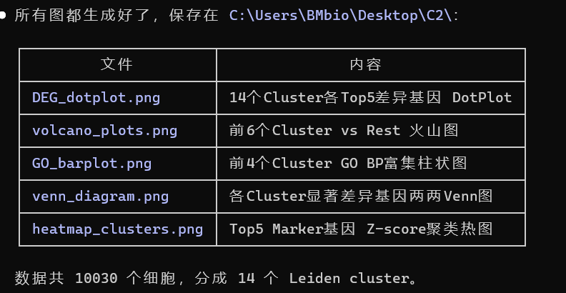
三、查看结果
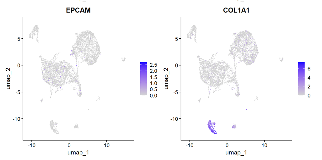
篇幅有限,此处只列举部分数据分析图像
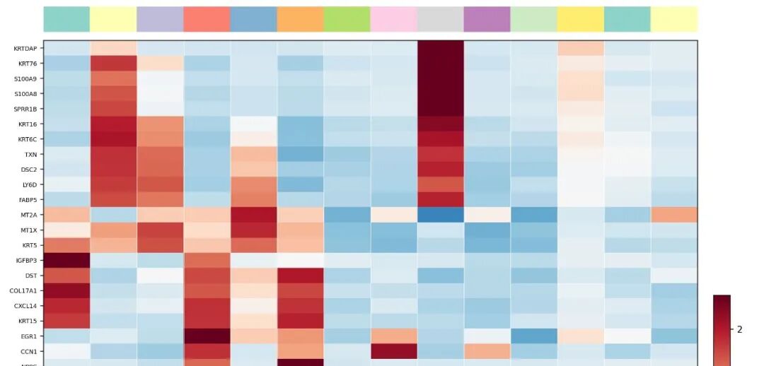
1. heatmap_clusters图:
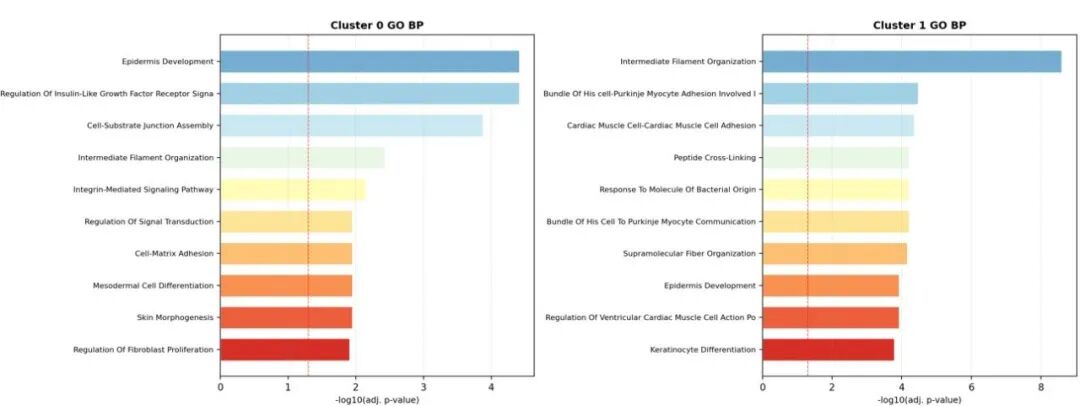
2. GO图
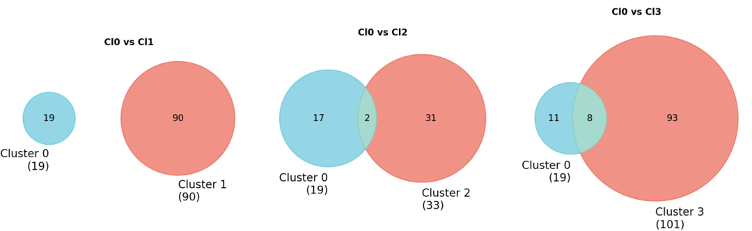
3. Venn图
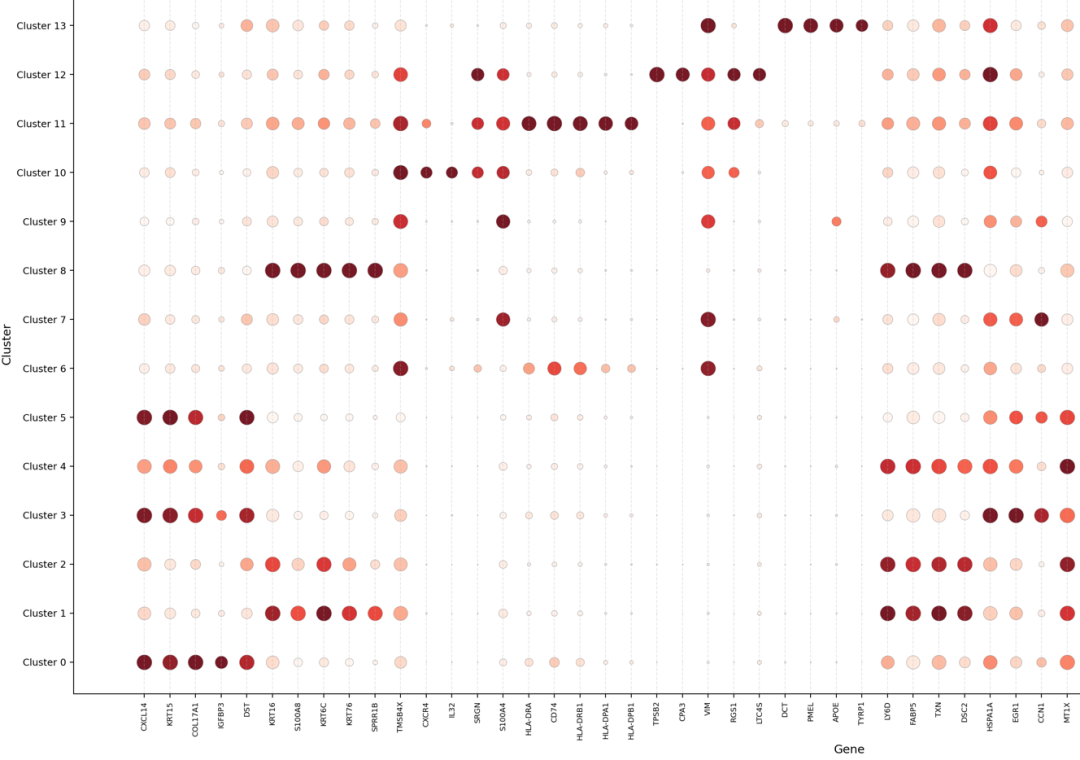
4. DEG_dotplot图
惊呆了...这个顶刊莫兰迪配色也是被新的 claude opus 4.7 模型给学习到了...
对比之前的Claude 4.6生成的灰色图片(如下),上面这些彩色生信分析图,实话讲,确实会给投递顶刊的文章,加不少分。
四、图形解读
最后,我们在让百沐一下 对以上生成的生信分析图(用heatmap为例),进行解读。

百沐一下还给出了适合放在SCI里的图注的解析(建议直接采纳学习):
Heatmap showing the top five marker genes for each cluster. Colors represent row-scaled expression levels (Z-score), with red indicating high expression and blue indicating low expression. Distinct cluster-specific transcriptional signatures support the identification of epithelial, stromal, antigen-presenting, mast cell, and melanocyte-like populations.
最后总结
研究生读的好,工具少不了!
Claude Opus 4.7 模型用在科研场景进行深度实测后,小编的第一反应是:科研效率的天花板再一次拉高了。新模型更多的学习和探索,从理论到实践还得看今后大家在各个科研工作场景中的运用。
懂科研,更要懂如何使用工具。进步,来自于对一个个新工具的学习和运用。所以,关注百沐一下,不止是Claude opus 4.7,期待与您一起在未来探索更多模型的学术实战上限。
浏览器搜索“百沐一下AI科研助理平台”,或者微信搜索“百沐一下”小程序
更多体验,等待您的探索!


欢迎加入DeepSeek 技术社区。在这里,你可以找到志同道合的朋友,共同探索AI技术的奥秘。
更多推荐


 18
18 0
0- 0


 已为社区贡献6条内容

所有评论(0)